What the Wall Wants: A Floor Lamp Finish Guide for Sitting Rooms
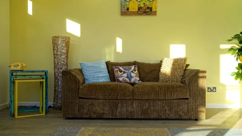
A floor lamp finish is rarely judged on its own. You see it against a wall, beside a sofa, under a shade, in the particular light of your sitting room at seven in the evening. That is why two lamps that look equally good in a showroom can behave completely differently at home. Brass can turn creamy or almost orange. Black can sharpen a pale wall or disappear against a dark one. Bone can feel calm or simply insubstantial. Nickel can look crisp or a little clinical.
So rather than asking which finish is best, ask what your wall wants. The finish is a relationship, not a swatch.
Start with the wall, not the lamp
In UK sitting rooms, a few wall colours come up again and again: warm off-whites, soft greys, and deeper period hues such as olive, clay, plum or navy. Each changes how a metal reads.
Against warm off-white, brass tends to look golden and generous. It picks up the warmth in the wall and makes the corner feel lived-in. Black becomes a deliberate graphic line, which is useful if the room needs a bit of definition. Bone almost melts into the background, so the lamp's shape has to do the talking. Nickel introduces a cooler note and can look very clean, especially in newer builds.
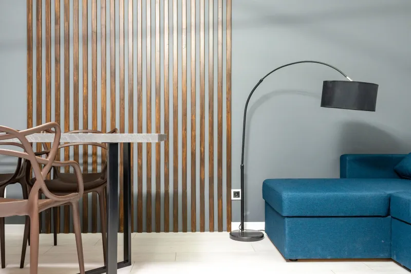
On soft grey walls, brass gives a welcome hit of warmth without shouting. Black looks tailored and slightly more formal. Nickel blends in a quiet, contemporary way, while bone softens the grey and stops it feeling too cool.
Deeper period colours are where finish choices get interesting. Brass looks rich and traditional against olive or navy, though it can become quite theatrical. Black can either ground the scheme or vanish into a dark wall, depending on the shade and the light. Nickel offers a crisp contrast, and bone lifts a moody corner without making it feel fussy. If you are in a Victorian or Edwardian terrace with original coving and a chimney breast, it is worth viewing the lamp against the wall at night as well as in daylight. Period rooms change character after dark.
What each finish does to the room
Brass is the warm diplomat. It adds a little formality without being stiff, and unlacquered brass will patinate over time, which suits older homes. It can make a slim lamp feel more substantial, but too much brass in one sightline can tip a sitting room towards hotel-lobby territory.
Black is the most graphic. It gives a room a clear silhouette and works well with crisp linen shades, dark wood and painted joinery. A black floor lamp can make a space feel more composed, but it also draws the eye. If your sitting room is already busy, consider a slimmer profile rather than a heavy base.
Nickel is cooler and more reflective. It suits modern rooms, grey schemes and anyone who prefers shine without warmth. In a period room, nickel can look smart and unexpected, but it can also feel a bit sharp next to very warm woods and ochre fabrics. Bone is the quiet one. It is excellent for small rooms, pale schemes and layered textiles, but it needs enough shade and base to avoid looking lightweight. Coloured finishes are the wildcard: a deep green, oxblood or chalky blue lamp can be a lovely accent, provided it relates to something else in the room rather than arriving like a prop.
The shade is half the finish
A brass lamp with a cool white shade can look cheap; a bone lamp with a heavy black shade can look confused. The shade controls the mood as much as the metal does. Cream, oatmeal and natural linen shades keep brass warm and bone soft. A black shade makes brass more dramatic and black more architectural. Grey or pale grey shades flatter nickel. Pleated shades add formality; plain drum shades feel more contemporary; tapered shades suit period rooms.
Also check scale. A large shade on a slender lamp makes the finish feel more important, because there is more surface to catch the light. A small shade keeps the base as the main event. Neither is wrong, but the proportion should suit the height of the lamp and the wall behind it.
Mixing metals without the showroom effect
Most UK sitting rooms already contain several metals: radiator valves, door handles, curtain poles, a lamp base, maybe a coffee table leg. You do not need to match them all. A useful rule is to choose one dominant metal, repeat a second metal at least twice, and keep any third to a small accent. For example, brass floor lamp, brass curtain pole, black lamp shade trim, nickel door handle. The repetition makes the mix look intentional.
Avoid treating the floor lamp as a metal sample board. One good finish in a well-chosen spot will do more than three competing finishes. If you want to mix, tie the lamp to something at sitting height rather than something near the ceiling. That keeps the scheme grounded.
The bulb matters as much as the brass
A warm finish cannot rescue a cold bulb. In a sitting room, aim for around 2700K, dimmable if possible, and avoid anything that reads as office-white. Warm light makes brass glow, softens black and keeps bone from looking grey. Very warm bulbs can push brass towards orange, so check the lamp at night before committing. Nickel reflects cooler light, which can be useful in a dark corner but harsh in a cosy one.
Finally, test the lamp where it will live. Move it a metre left and right. Look at it from the sofa, not just the doorway. The right finish is the one that makes the wall behind it look better, not the one that wins on its own.